
Project Codename Summarizer Part 5 - Finalizing UI/UX

Design System Ideation and LLM Brainstorming
The ugly prototype UI was nice and fun to test the potential, but it wasn't going to take me anywhere.
As said in a previous post, I had intentionally decoupled my layers so that I could drop in a new UI, without affecting anything else.
Also, this would allow me later to keep the view model and API service layers intact, and make an iOS version by just making a new frontend UI for it. Apple's universal apps are really powerful in that sense.
But even if I polished my prototype UI all the way through, it's just not a good experience for my future users, and I want the best experience for them. I'm not a designer, but I think I do have a sense for good UI and UX.
This meant I had to completely forego my prototype one and start from scratch.
Still in the theme of vibe coding, I did it with the help of ChatGPT o3 and the newly released high-definition image generation.
I started by describing what my app could do, without describing how it should do it.
This was my initial prompt:
This is the description of the features of a Mac app:

	- Ability to add a URL to download and save its audio
	- Ability to import a file
		- If the file is an audio file, it is saved as is
		- If the file is a video file, the audio track is extracted and saved

	- The audio file can then be played, paused

	- The obtained audio file can then be transcribed using an online service. We show the transcription.
	- For the transcription, the user can
		- optionally add some specific terms to help with the transcription
		- optionally set the transcription language (default is English)

	- The transcription, either obtained through the service with the audio file, or pasted by the user, can then be summarized by another online service.
	- For the summarization, the user can
		- optionally add custom prompts to refine and orient the summarization.
		- optionally set the output language (default is English)

	- There is a way to globally clear and cancel everything and restart fresh

I want you to come up with design ideas for this app.

Think about the layout, colors, fonts, size, interactions, and suggest 5 ideas of design.

For each idea, use whatever you think is useful to explain this design, this includes but is not limited to:
	- Textual description
	- ASCII art
	- Wireframes

Prioritize ease of use and intuitiveness. Follow Apple’s HIG.
o3 was happy to think and give me five design concepts, which were basically in a nutshell:
A classic three-pane Mac app, with everything visible all the time
A workflow ribbon based app, with a contextual center view
A cardboard-like spatial canvas (think Trello or Jira)
A dual mode app with menu bar and a full window, with three panes as well (variation of the first)
A bottom sheet based UI, with all control visible on the bottom and results in the main view below (think Apple Maps on iOS)
After thinking about it myself, and eliminating what I didn't like or envision for my users, I ended up selecting the workflow ribbon one:
Let's develop the second idea, the Progressive “Workflow Ribbon”.

Generate a full documentation for this design, include absolutely everything that the user needs to know in order to implement it.

You must describe a full design system, only in textual format this time.

	This includes, but is not limited to:
	- Layout
	- Margins, padding
	- Sizes, relative and absolute ones
	- Colors, in light and dark mode
	- Controls
	- Wording of the controls
	- Interactions and animations
	- Font to use (choose a nice, modern, rounded, sans serif one)
	- etc.

If you need to mention implementation details, use SwiftUI for Mac.

If something is unclear, ask me.
A few minutes later, I had my design system and an exhaustive documentation for my app.
I also asked ChatGPT o3 to generate some mockups, they will come in handy later.
Of course, it needed some refinement, but it was a good base to get started.
And if I didn't like it, going back to the drawing board would have cost me just a couple of hours at most.
Implementing the Design System
I gave Cursor (still with Gemini 2.5 Pro) this design system documentation and asked it to implement it.
However, there's a trick! Making the UI and wiring the UI to the view model are two very different tasks.
LLMs tend to trip when many aspects are involved in the same step.
So whenever you can, it's always good to keep a concise focus on what you ask from an LLM/agent. You can always iterate and add tasks later, but if you don't do it and it ends up mixing things up, you will have to restart from scratch.
That's why I told it first to implement the UI, but only the UI, completely separate, in an independent file, and to absolutely avoid wiring anything to the rest of the app. (I even removed the rest of the codebase for the context).
Let's implement a new UI in a new file.

Focus only on implementing the following specifications.

Do not wire it to anything else, we will do it later.

[...Design Doc...]
Then, after the UI was nicely implemented and all errors fixed, I could ask it to wire the view model. It was super exciting, because if that worked (and I made sure all the way through to think proactively of this), it would prove that my layers are well separated and that my documentation and APIs are good:
Now let's wire @SummarizerAppView.swift to @ViewModel.swift.

Each view/feature should have something matching there.

If you need help, you can take a look at @ContentView.swift that is a debug view implementation.

Modify only @SummarizerAppView.swift. Modify @ViewModel.swift only if absolutely necessary. Do not modify anything else.

Remove all placeholders and fake behaviour code in @SummarizerAppView.swift.

If something is missing or unclear, ask me.
It worked really well. The app was beginning to feel real.
Iterating and filling the gaps
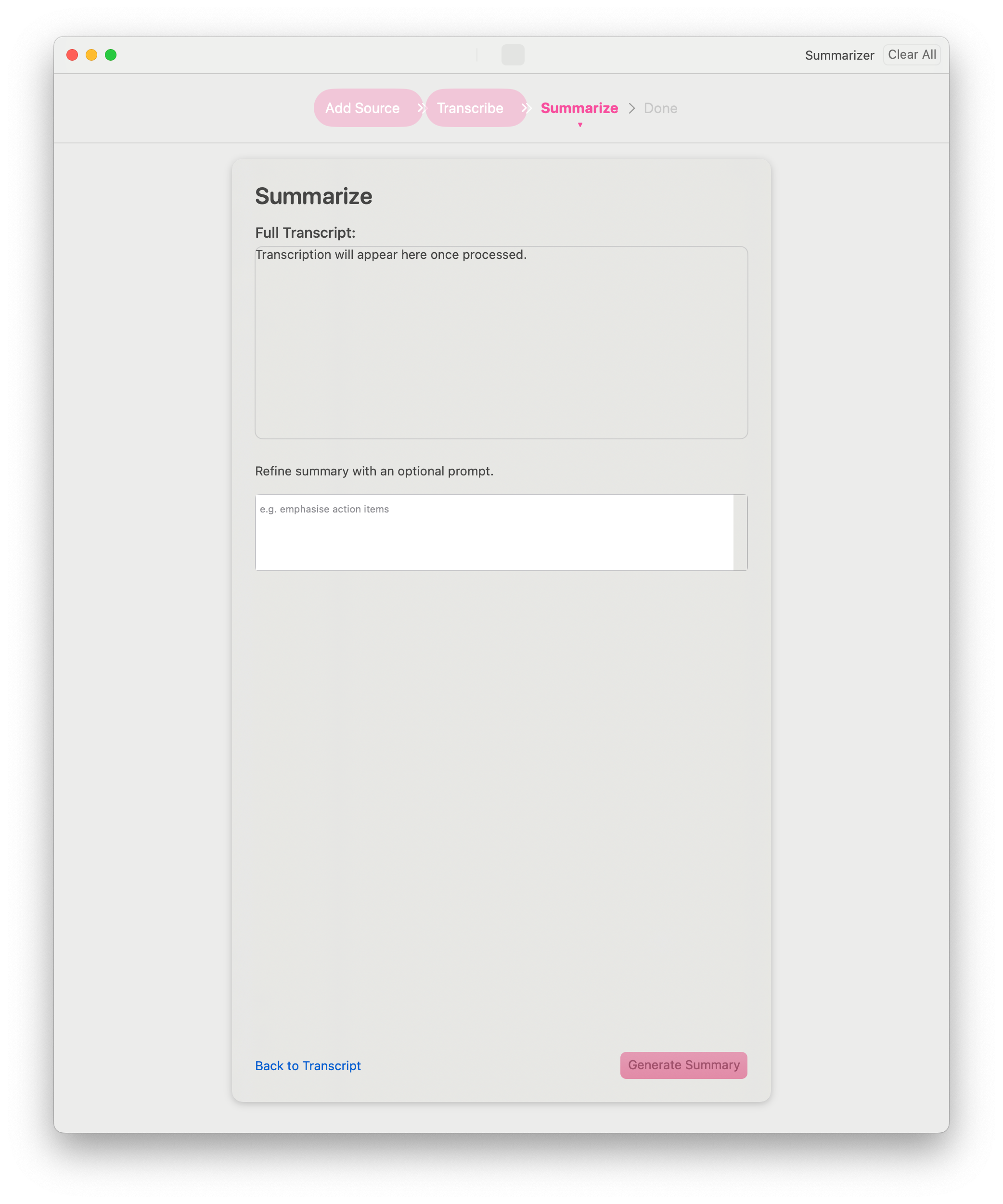
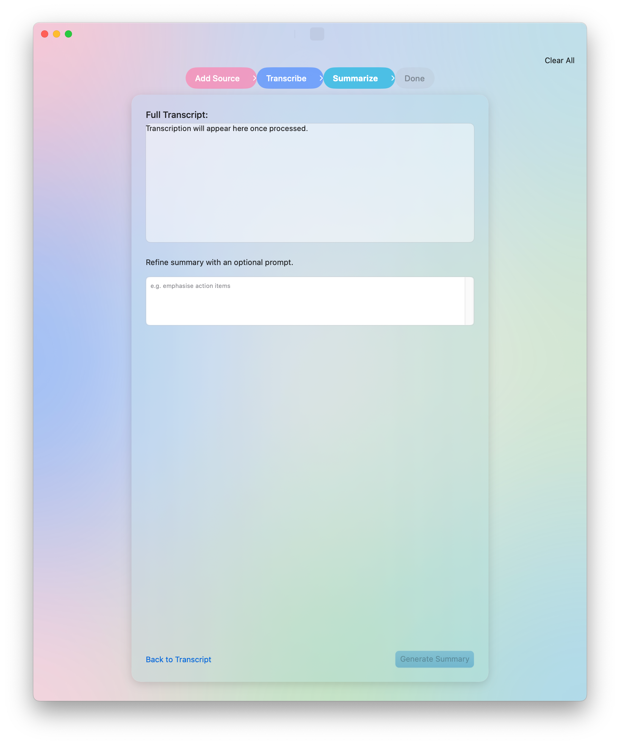
However, there were a few issues:
We asked ChatGPT for a design doc + visual mockups
We made the UI in Cursor with the design doc
In the end, the visual mockups and the UI made in Cursor weren't really matching
This is because, like when humans communicate with documents, some details are lost in translation and interpretation, because of the many intermediary representations as well as the non deterministic nature of LLMs.
In order to fix that, I first made sure to have a working UI (wired to the view model).
Then I asked ChatGPT to refine the visual mockup with my own ideas (color gradients, window bar, etc.). I asked the mockups for all the screens (it took some time).
Then, I gave Cursor the image that I felt represented the most what I envisioned, and asked it to refine the UI based on this.
After a few iterations, I finally had a working UI, still not final, obviously, but I was mostly happy with it for the time being.
And also, I finally had an app icon!
What do you think?
P.S.: If you’ve reached this point, I’m looking for beta testers on TestFlight, feel free to contact me if you’re interested in Summiqo!
This looks promising. I'll test it in my projects.